
In this post, we will learn how to create a card view with child views using custom layouts. Creating a custom card unifies the experience for the user, gives us more control on the design of the app and speeds up the cross-platform UI/UX workflows. It is easy to get a simple, yet flexible, card introduced in your app.
Update: Get this card as part of IntelliAbb Xamarin Controls NuGet package.


Creating The Card
A custom layout is a configurable custom view. The key is that we use bindable properties to configure and customize it. In this post, we will use a Frame as our main container, just so we get a shadow effect and corner radius out-of-the-box. Then, we will add some properties to configure the card appearance and use it in different views.
Note: It is a good practice to keep your controls in a separate library. It makes maintenance and customization easier.
In our example, we are going to create a new ContentView using XAML called ShadedCard (not a great choice for a name, but you may have <ClientName>Card or something). Since it is a XAML view, we get the .xaml file and the code-behind .xaml.cs file. This is important as we will design our UI in the XAML file, and bind it to our code-behind file where we will declare our bindable properties.
Parts
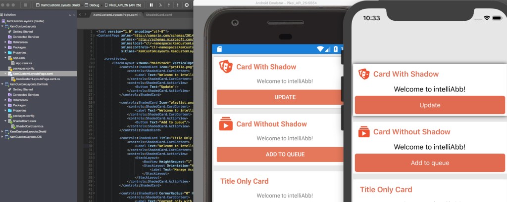
The card we will create in this tutorial will have the following 4 sections, and since we want them to be configurable, we will make them bindable using BindableProperty,
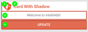
- Icon
- Title
- Content View
- Action View
Each of these properties have a corresponding bindable property in the code-behind so that we can configure the card from the “outside”. When we drop this card on any of our page or view, we can configure the card using these bindable properties. Here is how the UI looks for our card in XAML,
<Image Source="{Binding Icon, Source={x:Reference this}}" />
<Label Text="{Binding Title, Source={x:Reference this}}"
       Style="{Binding TitleStyle, Source={x:Reference this}}" />

<!-- Content -->
<ContentPresenter
        Content="{Binding CardContent, Source={x:Reference this}}"/>

<!-- Action Items -->
<ContentPresenter
        Content="{Binding ActionView, Source={x:Reference this}}"/>
this is the name of my control, it could be anything you like. Here is how the code-behind looks for these properties,
public static BindableProperty IconProperty = BindableProperty.Create(nameof(Icon), typeof(ImageSource), typeof(ShadedCard), propertyChanged: IconTitleGridVisible);
public ImageSource Icon
{
   get { return (ImageSource)GetValue(IconProperty); }
   set { SetValue(IconProperty, value); }
}

public static BindableProperty TitleProperty = BindableProperty.Create(nameof(Title), typeof(string), typeof(ShadedCard), propertyChanged: IconTitleGridVisible);
public string Title
{
   get { return (string)GetValue(TitleProperty); }
   set { SetValue(TitleProperty, value); }
}

public static BindableProperty TitleStyleProperty = BindableProperty.Create(nameof(TitleStyle), typeof(Style), typeof(ShadedCard), defaultValue: (Style)Application.Current.Resources["SomeStyleName"]);
public Style TitleStyle
{
   get { return (Style)GetValue(TitleStyleProperty); }
   set { SetValue(TitleStyleProperty, value); }
}

public static BindableProperty CardContentProperty = BindableProperty.Create(nameof(CardContent), typeof(View), typeof(ShadedCard), propertyChanged: IconTitleGridVisible);
public View CardContent
{
   get { return (View)GetValue(CardContentProperty); }
   set { SetValue(CardContentProperty, value); }
}

public static BindableProperty ActionViewProperty = BindableProperty.Create(nameof(ActionView), typeof(View), typeof(ShadedCard));
public View ActionView
{
   get { return (View)GetValue(ActionViewProperty); }
   set { SetValue(ActionViewProperty, value); }
}
parts of the code are removed for brevity, so make sure to checkout the complete code on GitHub (link below).
Now, the card is ready to be placed in any page or view.
Usage
To use the card, simply add it to your XAML or C# code, and provide values to your properties. All parts of the card are optional, so you can mix and match to your design requirements.
In XAML
Depending on where you place your custom layout/control, bring in the namespace, if needed.
xmlns:controls="clr-namespace:XamCustomLayouts.Controls;assembly=XamCustomLayouts.Controls"
then,
<controls:ShadedCard Icon="profile.png" Title="Card With Shadow" CornerRadius="0" HasShadow="true" TitleStyle="{StaticResource SectionTitleText}">
  <controls:ShadedCard.CardContent>
      <Label Text="Welcome to intelliAbb!" VerticalOptions="Center" HorizontalOptions="Center" />
  </controls:ShadedCard.CardContent>
  <controls:ShadedCard.ActionView>
      <Button Text="Update"/>
  </controls:ShadedCard.ActionView>
</controls:ShadedCard>
In C#
var card = new ShadedCard {
  Icon = "icon.png",
  Title = "My Card",
  ContentView = new StackLayout {
    . . .
  },
  ActionView = new StackLayout {
    . . .
  },
};

// assuming you have a child-bearing container as parent,
Parent.Children.Add(card);
MVVM Data Binding
If you are using MVVM in your Xamarin.Forms app (as you should :)), you will find that binding to a control inside a view that is child of this card view, the implicit bindings will not work as the child control does not know about the grandparent control (page) and it’s binding context. So, you will have to explicitly bind to the page’s binding context by simply doing the following,
- Name your page. i.e.
<... x:Name="MyPage"/> - Bind explicitly. i.e.
<Label Text="{Binding BindingContext.PropertyName, Source={x:Reference MyPage}}"/>
That is it. You just told your grand child control/view to bind to MyPage‘s BindingContext, which is your ViewModel.
Have questions or comments? Leave them below.
Enjoy!
Resources
NuGet: Get this card as part of IntelliAbb.Xamarin.Controls NuGet package.
GitHub repo: https://github.com/Intelliabb/XamCustomLayouts
 IntelliAbb
Leave a comment