
When building mobile app UI that requires controls and transitions that are not available from the platform “out-of-the box”, we either create our own or use a third-party library to accomplish the design. I had a similar need recently for gauges and charts in one of my client’s Xamarin.Forms application. Telerik UI for Xamarin makes it a breeze to get your UI looking good, fast.

Having built IntelliAbb.Xamarin.Controls – my own Open Source Software (OSS) controls library for Xamarin.Forms, I first thought about creating my own. But under the common sense of not “reinventing the wheel”, I looked around for other OSS and third-party libraries that could accelerate my mobile development. While there are several great offerings out there for Xamarin controls by Telerik (Progress), Syncfusion, GrailKit, Aurora, etc. I decided to start with Telerik UI for Xamarin. In this post I will share my experience building a list view with grouping, expand/collapse view, followed by charts, gauges, etc. along with some lessons learned.
Toolkit
Telerik has an extensive list of components for Xamarin.Forms, Xamarin.iOS, and Xamarin.Android. One can easily build an entire app with Telerik UI for Xamarin given their excellent documentation.

Documentation
Telerik team did an excellent job on their documentation. The documentation covers each component in a structured manner with examples in XAML, code-behind, and also DataBinding using MVVM pattern.
Getting Started
If you are not sure Telerik has what you need, you can start with a free trial. Go start your trial, go to www.telerik.com and click on Get Free Trial button. Select Telerik UI for Xamarin under Mobile section, then fill out some info and download the SDKs. Follow the setup steps show in https://docs.telerik.com/devtools/xamarin/getting-started to get up and running on Windows or Mac.
Note: I highly recommend you install the Telerik Visual Studio extension for Windows or Mac that comes with Telerik Project templates. It makes it a lot simpler with all the available namespaces already configured in your XAML file.
ListView, Grouping, Expand/Collapse
In this post, we will build a ListView and groups its content. We will also style the header and get expanding/collapsing. And all this following MVVM pattern with DataBinding 👍
👀 Beware
ListView in Telerik UI for Xamarin looks similar to ListView from Xamarin.Forms at first. But as soon as you start to customize the ListView or cells in the ListView, you will realize that it is not. Compared to Xamarin.Forms ListView, ListView in Telerik UI for Xamarin offers better performance and virtualization, load on demand, data operations, layout modes, and the additional features like swipe gestures, sticky headers, and much more (not covered in this post). So, make sure you keep the documentation handy to explore the ListView APIs.
Lets start setting up the ListView,
Step 1 – Data
Before we jump into building the ListView, let’s get the data ready. Nothing special here, just a Model with a ViewModel that provides DataBinding, so really quickly here’s the setup for our ListView,
Model
public class User
{
    public string Name { get; set; }
    public string EmailAddress { get; set; }
    public int Progress { get; }
    public int Capacity { get; }
    public int Completed { get; }
    public int Total { get; }

    public User()
    {
        // For demo
        var r = new Random();
        Total = r.Next(5, 20);
        Completed = r.Next(4, Total - 1);
        Progress = (Completed * 100) / Total;
        Capacity = r.Next(25, 100);
    }
}
ViewModel
public class TasksViewModel
{
    public ObservableCollection<User> TeamStatus { get; }
    public TasksViewModel()
    {
        Title = "Team Status";
        TeamStatus = GetTeamStatus();
    }
    ObservableCollection<User> GetTeamStatus()
    {
        return new ObservableCollection<User> {
            new User { Name = "Hussain A.", EmailAddress = "h@h.com" },
            new User { Name = "John P.", EmailAddress = "j@j.com" },
            new User { Name = "Charlotte V.", EmailAddress = "c@v.com" },
            new User { Name = "Kimberly R.", EmailAddress = "k@r.com" },
            new User { Name = "Steve J.", EmailAddress = "s@j.com" }
        };
    }
}
Now, let’s build the view.
Step 2 – Define Namespaces
<...
	xmlns:telerikDataControls="clr-namespace:Telerik.XamarinForms.DataControls;assembly=Telerik.XamarinForms.DataControls"
	xmlns:telerikListView="clr-namespace:Telerik.XamarinForms.DataControls.ListView;assembly=Telerik.XamarinForms.DataControls"
	xmlns:telerikCommon="clr-namespace:Telerik.XamarinForms.Common;assembly=Telerik.XamarinForms.Common"
.../>
Note: All the namespaces are automatically added to your XAML file if you are using Telerik Visual Studio extensions mentioned above.
Step 3 – RadListView
RadListView requires some configuration before it looks how we expect it to. This is where things are a little different than Xamarin.Forms.ListView. Let’s start
<telerikDataControls:RadListView
            ItemsSource="{Binding TeamStatus}">
</telerikDataControls:RadListView>
Step 4 – LayoutDefinition
RadListView does not have HasUnevenRows or RowHeight property, which means you cannot set cell/row height at RadListView level. Instead, RadListView has a LayoutDefinition property that configures the layout of the RadListView. You can set the type of layout (Linear or Grid) as well. Pretty cool.


For our example, we are using Linear layout and to set the height of our cell/row, we set ItemLength of ListViewLinearLayout which is in Telerik.XamarinForms.DataControls.ListView namespace.
<telerikDataControls:RadListView.LayoutDefinition>
    <telerikListView:ListViewLinearLayout ItemLength="200" />
</telerikDataControls:RadListView.LayoutDefinition>
Step 5 – Grouping
This is where RadListView shines. Using out-of-the-box Xamarin.Forms.ListView requires some sort of a collection of a collection in order to achieve grouping, in RadListView, we simply provide the grouping property name to the RadListView by setting its GroupDescriptors property (which is in namespace Telerik.XamarinForms.DataControls.ListView). Simply,
<telerikDataControls:RadListView.GroupDescriptors>
    <telerikListView:PropertyGroupDescriptor PropertyName="Name"/>
</telerikDataControls:RadListView.GroupDescriptors>
Group Header
Once we have set GroupDescriptors, we create the header view. Note how in the line highlighted below, we bind the Text property to the property named in the GroupDescriptors.
<telerikDataControls:RadListView.GroupHeaderTemplate>
    <DataTemplate>
        <Grid>
            ...
            <Label Text="{Binding }" />
        </Grid>
    </DataTemplate>
</telerikDataControls:RadListView.GroupHeaderTemplate>
Step 6 – List Items Template
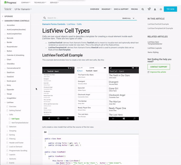
RadListView has two types of Cells, ListViewTextCell and ListViewTemplateCell. As the name suggest, for simple text list items we can use former, but for more complex views, we use the later. In our example, we use ListViewTemplateCell.
<telerikDataControls:RadListView.ItemTemplate>
    <DataTemplate>
        <telerikListView:ListViewTemplateCell>
            ...
        <telerikListView:ListViewTemplateCell>
    <DataTemplate>F
<telerikDataControls:RadListView.ItemTemplate>
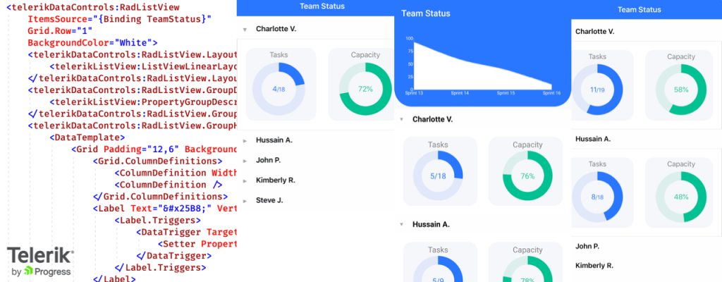
Full view is here.
Final result (will talk about the gauges next).


With a little bit of learning and navigating the docs, I find that Telerik UI for Xamarin makes it a breeze to get your UI looking good, fast.
Charts 📊 And Gauges 🌡️
Charts and Gauges require separate posts. In coming weeks, I will have a post on Charts and how to customize the chart to look more modern. Similarly, how to customize a gauge quickly to make it fit in your design with ease. Stay tuned.
Resources
Sample code: https://github.com/hnabbasi/TelerikListView
 IntelliAbb
Leave a comment