
Control Templates are a great way to customize your app’s view with themes and custom layouts. You can also use them to wrap your content and get a beautiful experience for your users. In this post, we will see how to use Control Templates to create custom layouts.
Control Templates 👌🏼
ControlTemplate is a property of TemplatedPage class. A ContentPage derives from TemplatedPage and can define its own control template to display its content. Similarly, ContentView drives from TemplatedView that has a ControlTemplate property. ContentPage and ContentView present the content using ContentPresenter.
Creating Control Templates
I recently added a CardView to my IntelliAbb.Xamarin.Controls NuGet package. In that card, I use control templates for choosing one layout over another based on the card configurations. In this post, I will demonstrate how you can start using ControlTemplates to enhance your app experience.
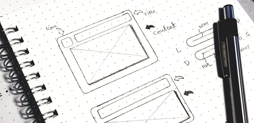
The CardView in this post can be configured in 3 ways,

- Icon, Title, Content
- Title, Content
- Content
We can also have Icon, Content configuration, but that will not change the layout significantly. To get these configurations, we create two simple templates, IconTitleTemplate and TitleTemplate. These templates will be ContentView that will be defined for the CardView control which is a Frame.
For these templates, I build my UI in C# only. But you can also build your templates in XAML just as well. If you need an example, leave a comment and I will provide an example.
public class IconTitleTemplate : ContentView
{
    var titleLabel = new Label {...};
    var icon = new Image {...};
    Content = new StackLayout {
        Children = {
            new StackLayout {
                Orientation = StackOrientation.Horizontal,
                Children = {
                    icon,
                    titleLabel
                }
            },
            ...
        }
    };
}
Pretty basic stuff. Now the title only template,
public class TitleTemplate : ContentView
{
    var titleLabel = new Label {...};
    Content = new StackLayout {
        Children = { titleLabel }
        ...
    };
}
Almost there. Now, where’s the magic? Whole point of using ControlTemplate is to show your content in a template. To show your content, we need a ContentPresenter in our template. Add it to your template as,
Content = new StackLayout {
    Children = {
        new StackLayout {
            Orientation = StackOrientation.Horizontal,
            Children = {
                icon,
                titleLabel
            }
        },
        new ContentPresenter()
    }
};
And that’s it for creating/defining templates.
DataBinding
To bind properties in ControlTemplate, use TemplateBinding to parent control properties. In the CardView control, the Icon and Title are bindable along with their Style property.
titleLabel.SetBinding(Label.TextProperty, new TemplateBinding("Title"));
titleLabel.SetBinding(StyleProperty, new TemplateBinding("TitleStyle"));
...
icon.SetBinding(Image.SourceProperty, new TemplateBinding("Icon"));
icon.SetBinding(StyleProperty, new TemplateBinding("IconStyle"));
Consuming Templates

You can consume templates in any way your app requires. Simple theming, or complex templates with binding properties, etc. The CardView uses the templates based on Icon property. If the Icon is set, then it choose IconTitleTempalte, otherwise TitleTemplate is used.
Card with Icon and Title,
<CardView Icon="faces.png" Title="Card With Shadow">
    ...
</CardView>
Card with Title,
<CardView Title="Title Only Card">
    ...
</CardView>
Content only,
<CardView Icon="faces.png" Title="Card With Shadow">
    ...
</CardView>
That’s it.
Resources
NuGet: IntelliAbb.Xamarin.Controls
You can find all the code on GitHub
Microsoft docs, ControlTemplate
 IntelliAbb
Leave a comment