
Xamarin.Forms is great. But, every now and then, it falls short on some basic modern controls e.g checkbox, radio buttons, cards, etc. Luckily, Xamarin community is large and very engaged with the platform. You can find plethora of custom controls or blogs on how to build custom controls for your project needs.
In recent years, I have created a bunch of custom controls that I am sure the community at large can benefit from. One such controls is a simple Checkbox. There are lots of implementations of checkbox available, but I wanted something simple and light, so I created one. Here’s how the checkbox works…

Nuget
Download the NuGet package here.
This checkbox is part of my plan
IntelliAbb.Xamarin.ControlsNuGet package that will have more modern and cross-platform controls for Xamarin.Forms.
API Reference
IntelliAbb.Xamarin.Controls.Checkbox extends Xamarin.Forms.ContentView and has the following additional properties and events,
Bindable Properties
| CheckColor | Xamarin.Forms.Color of the check-mark |
| FillColor | Fill Xamarin.Forms.Color when checked |
| IsChecked | Checked state of the check-mark as bool |
| OutlineColor | Outline Xamarin.Forms.Color of the check-mark |
| OutlineWidth | Outline and check-mark width as float |
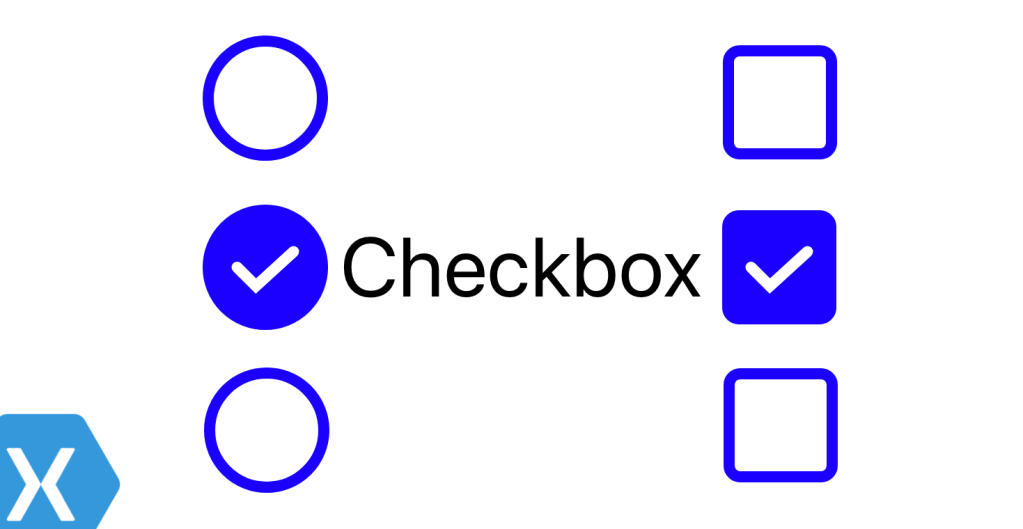
| Shape | IntelliAbb.Xamarin.Controls.Shape of the check-mark. Circle or Rectangle |
| Style | Xamarin.Forms.Style that can be set via resource |
Events
| IsCheckedChanged | Raised when IsChecked is changed with TappedEventArgs args. |
Usage
This is the best part. It is as simple as using the Switch control. Simply add it to your XAML or create it in C#. No need for any Init() call on app startup.
XAML
Bring in the namespace,
xmlns:ia="clr-namespace:IntelliAbb.Xamarin.Controls;assembly=IntelliAbb.Xamarin.Controls"
use the control,
<ia:Checkbox x:Name="AwesomeCheckbox"
    OutlineColor="Blue"
    FillColor="Blue"
    CheckColor="White"
    Shape="Rectangle"
    IsCheckedChanged="Handle_IsCheckedChanged" />
C#
var checkbox = new Checkbox {
    OutlineColor=Color.Purple,
    FillColor=Color.Purple,
    CheckColor=Color.White,
    Shape=Shape.Rectangle //default is Circle
};
The latest version is in pre-release and will go into stable release soon. Try it out and feel free to leave a feedback here or create an issue on GitHub repo.


Documentation
For updates, complete API reference and documentation, visit github.com/Intelliabb/XamarinControls
 IntelliAbb
Leave a comment